Corporate Project - App Redesign
Redesign EXOS Appraisal App
Build a better App for appraisers to manage their business in one place.
9 months,
2020.6 - 2021.4
Karen Anderson, Raghavendra Kotakonda, Jinyi Ye


Problem
Usability issues and outdated UI resulted in complaints and a decrease in user engagement.
Solution
Completely redesigned App on iOS/Android and fixed usability issues to enhance the engagement & user experience.
Impact
Launched redesigned App in April 2021. UX improvement impacting 4K+ users, Reduced 50% cycle time, established mobile design system.
My Role
Lead product designer of the team. Responsible for UX/ UI, Visual Design, PrototypingEXOS is an industry-leading digital product suite for real-estate businesses.
The EXOS Appraisal App, designed in 2017, is a digital tool already used by thousands of US appraisers - it struggled to scale alongside the company's transformation and growth. The app's usability was challenged, the app architecture is outdated, and the reliability and performance issues increased exponentially.
During Summer 2020 - Spring 2021, I led efforts to evolve the App and address user pain‐points related to UI and features like manage schedule and check-in / check-out experience.
Context - Why the Apps?
Manage their appraisal business in one place
The App is crucial for property Appraiser’s business as they are actively using the App
to manage their work anywhere and anytime:
Problem Statement
Major usability issues and feature flaws resulted in complaints and a decrease in App’s engagement.
5 Major UX Issues in the Legacy App
With initial business insights and UX audit on the old app, I identified 5 major UX issues:
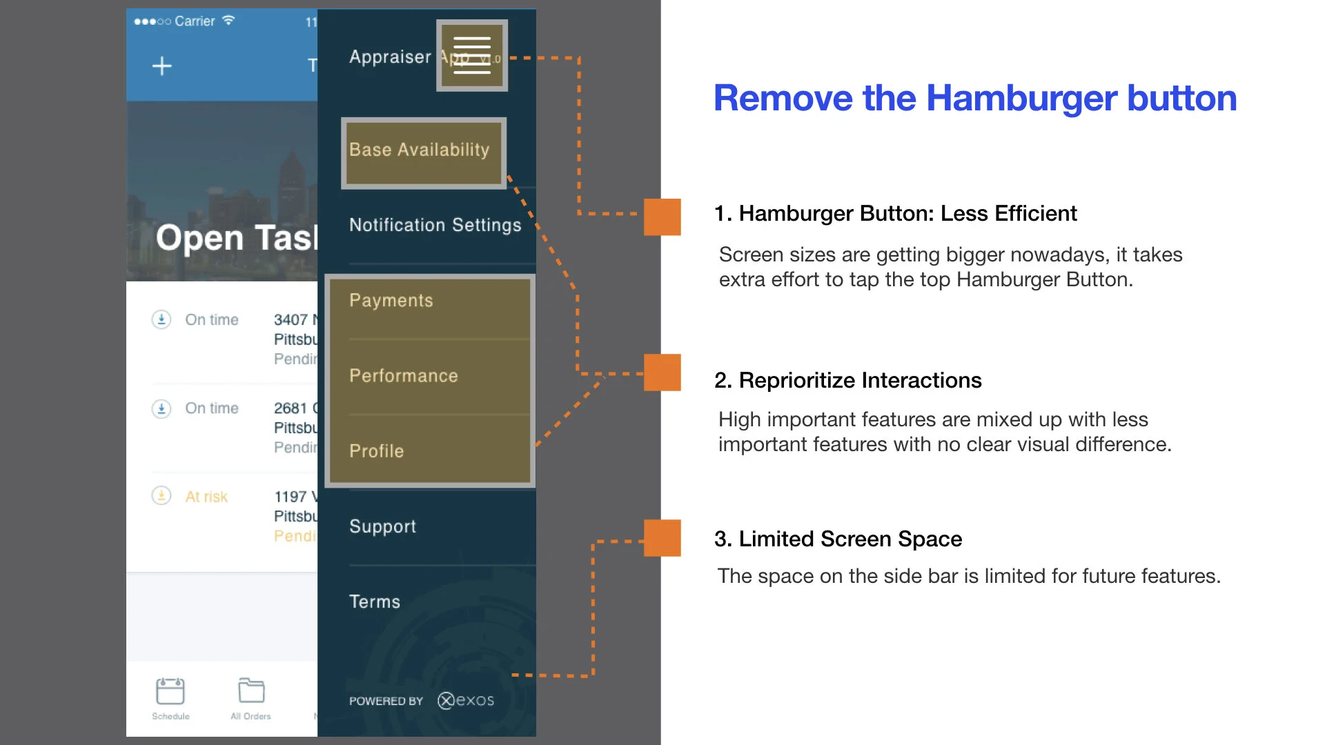
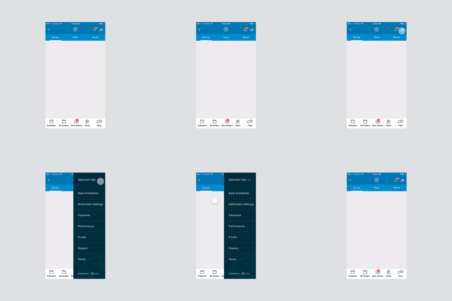
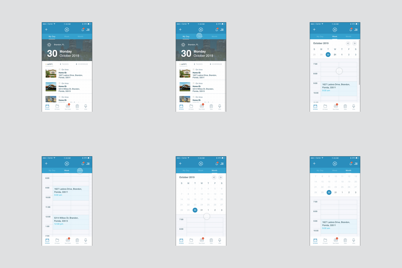
#1. Hamburger menu: no longer ideal
Features in the menu have no prioritization and no clear visual difference.
And it takes extra effort to tap the top Hamburger Button as the screen sizes are getting bigger nowadays.
#2. Poorly designed navigation increased cognitive load
It’s not necessary to use four tabs for different statuses of orders in different statuses. (Today’s/Future/Overdue/New)
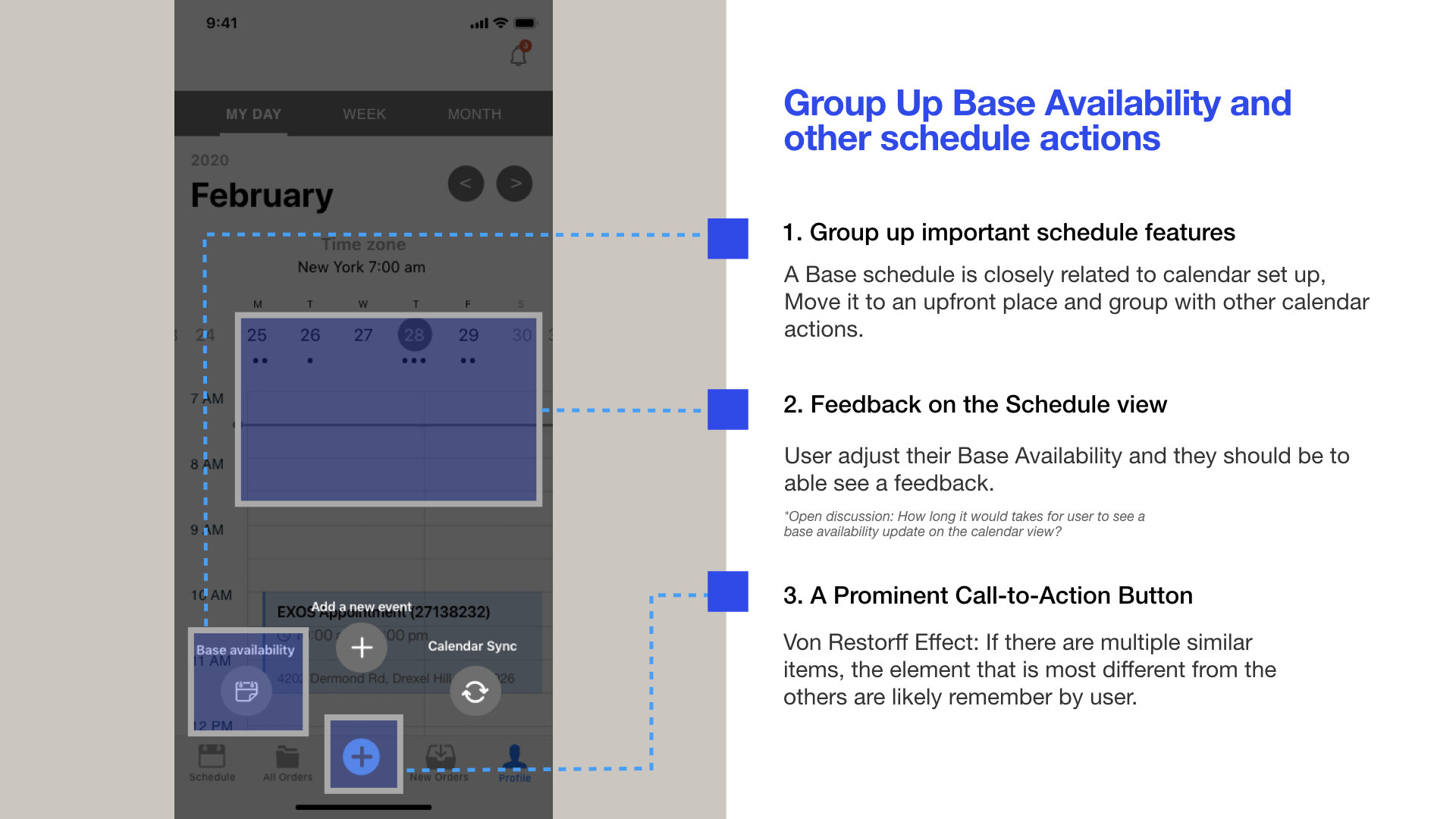
Critical features like “Base Schedule” and “Calendar Sync” were buried in the Hamburger menu and mingled in one view.
#3. Painful-to-use dropdown menu for frequently used actions
The “Actions“ menu received the most complaints as it’s hard to reach and lacks the visual distinction.
You will find these actions contradictory and not categorized; it often takes the appraiser a while to decide which action tap.
#4. Missing key alerts that resulted in phonecall follow-ups
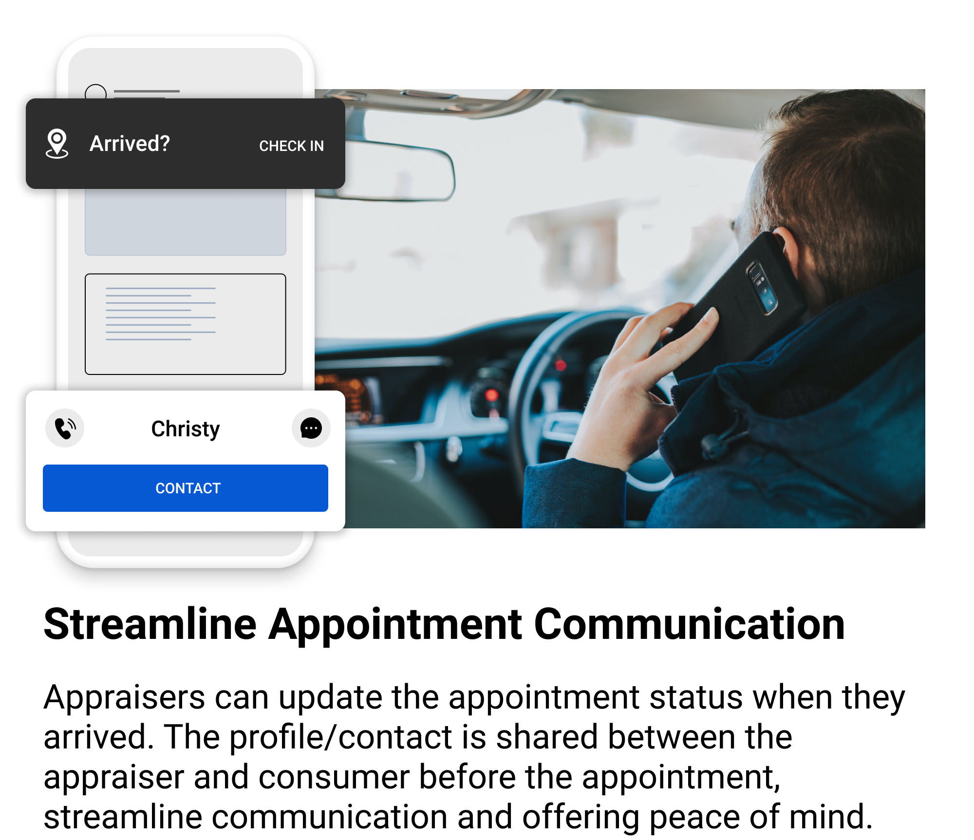
Appraisers need to check in to let borrowers know they arrived, and they need to check out to let the company know the appointment is finished.
No reminder alerts them to do it, so appraisers often forget check-in/check-out, which usually results in internal phone call follow-up.
#5. Outdated UI design with flaws of accessibility
The overall UI looks outdated and is built with Xamrian Web, which we are losing business engagements for this.
Furthermore, accessibility is not considered in the old App. It’s risky to continue with the old UI.
* * *
Design Research
Building the case and getting business buy-in
As a UX team, we knew that the future was to increase discoverability / engagement and shift to a bottom nav, but we needed to convince our business and tech partners.
“Boost Discoverability & Engagement
”
Bottom Navs Helps Boosts Important Business Metrics
Google’s Luke W. published compelling results which drive the point home.
Switching from hamburger to bottom nav drives engagement, satisfaction, speed, and task completion — all leading to improved conversion and revenue.
Bottom navs are good for business.
Plus, based on an A/B test by mobile app Zeebox presented by The Next Web show, using a Tab Bar to replace a Hamburger button can significantly increase the app’s engagement rate.
They found the tab bar drove a 55% average weekly frequency of use and an 8.7% higher average daily frequency.
55% Average weekly frequency of use
8.7% Higher average daily frequency
* * *
Bottom Navs Allow Multi-tasking (Think Browser Tabs)
In a bottom nav approach, each tab represents a distinct stack of screens that retains its own history as you navigate through them.
You can explore content from our Community in the INSPIRE tab while maintaining a separate product browsing journey in the SHOP tab.
A hamburger menu on the other hand represents just one stack. You can only perform one task at a time, because the root screen resets the stack every time you open the hamburger.
Bottom Navs are Easier to Reach
As mobile screens get bigger, reaching the top corners of the screen gets harder.
Bottom navigation is more comfortable for the thumb to reach, especially when navigating with one hand.
Gamification Strategy for better engagement and business result
With a fundamental gamification framework, we try to provide motivation for the appraiser’s work, introducing /points/levels/rewards to help them care more about their performance and the App itself.
With this in mind, I researched and developed a 16 pages gamification strategy and implementation plan for the App and got buy-in from related stakeholders.
Pitch ideas through Lo-fi wireframe and presentation
To get buy-in, I created a deck to demonstrate the insights we generated. I prototyped a cheap lo-fi wireframe because it helps team members focus on the new App structure we’re proposing.
UX Goals
After we got buy-in, got the project on the roadmap, I work with my manager to identify the UX goals.
Goals helped us align with the cross-functional (design/product/engineering) team on what we were trying to achieve and how we would get there.
Main Goals
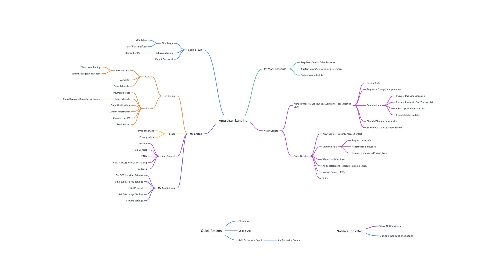
Migrate to bottom navigation and slightly reorganize the App information architecture with caution.
Fix major UX issues, improve usability and enhance accessibility to level AA of ADA compliance.
Secondary Goals
Drive App engagement with buried features like performance/base schedule/calendar sync.
Update the App styling.
Establish a native mobile design system.
* * *
Design
Design Principles
We synthesized all our inputs into four principles which guided the rest of our journey.
Make Features Informed and Discoverable
Respect the Platform’s Paradigms
Improving Aesthetic and Enforcing Consistency
Design Most Advanced Yet Acceptable Product
* * *
The Redesign
Refreshed, personalized, and easy-to-use


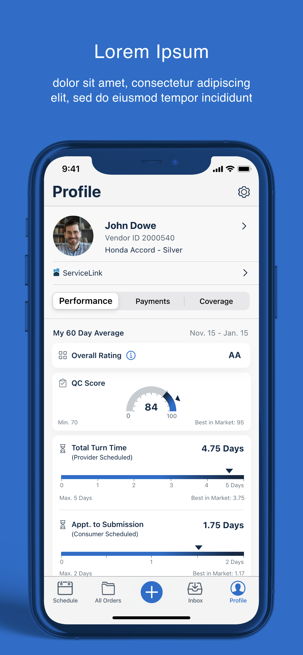
Prototype
Redesign Highlights
Prototype
Please try it yourself, it may takes several minutes to see the full picture.
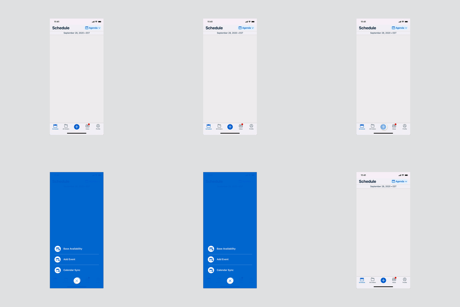
Bottom Nav Tabs: The Winning IA
Before
Critical features are buried with rarely used features in hamburger menu. The bottom nav bar is over used.
✔ After
Reorganized the bottom nav bar.
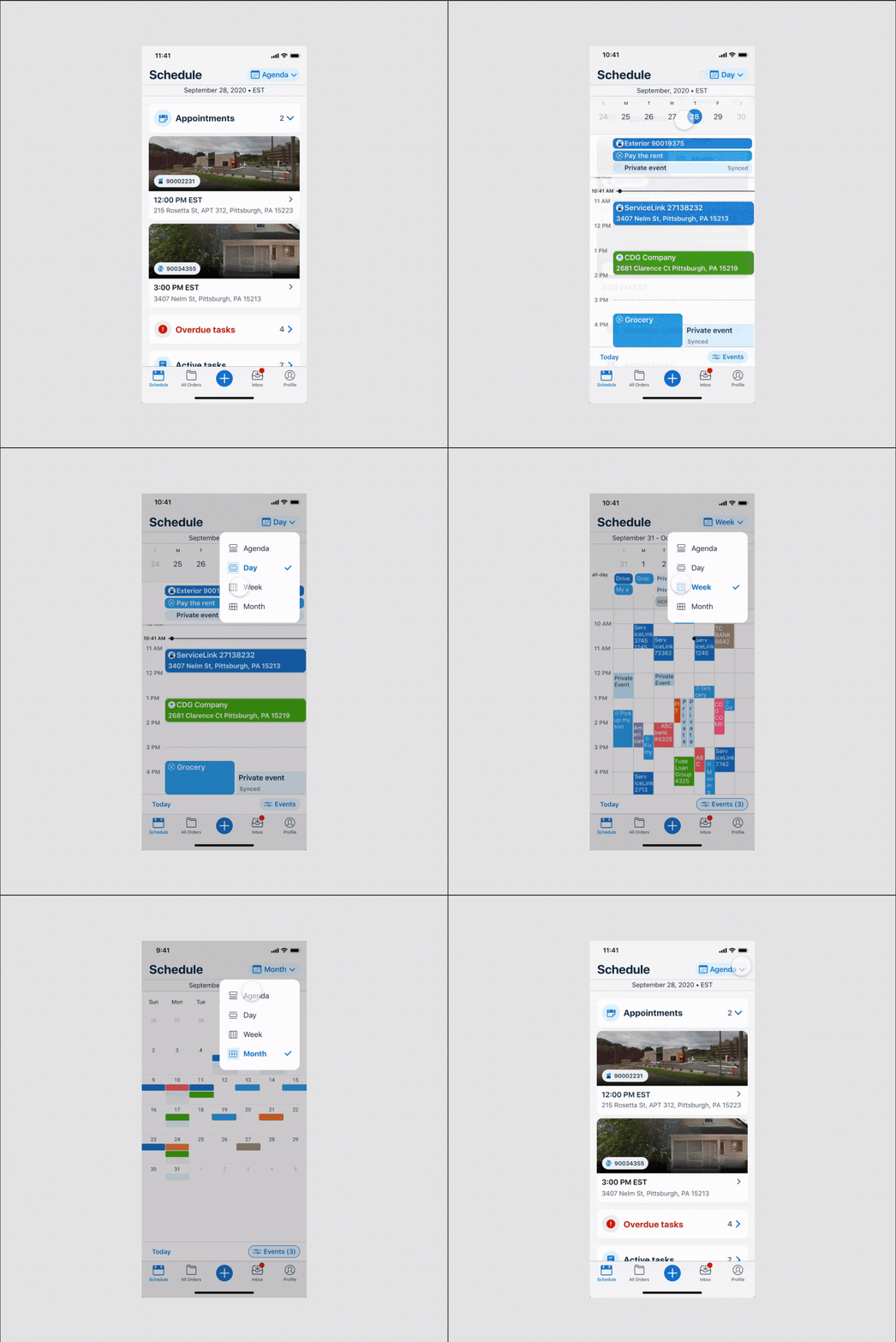
Home Tab: Get a Snapshot of your schedule
Before
“Week,“ “Month“ are essentially a “Day“ view with picker.
✔ After
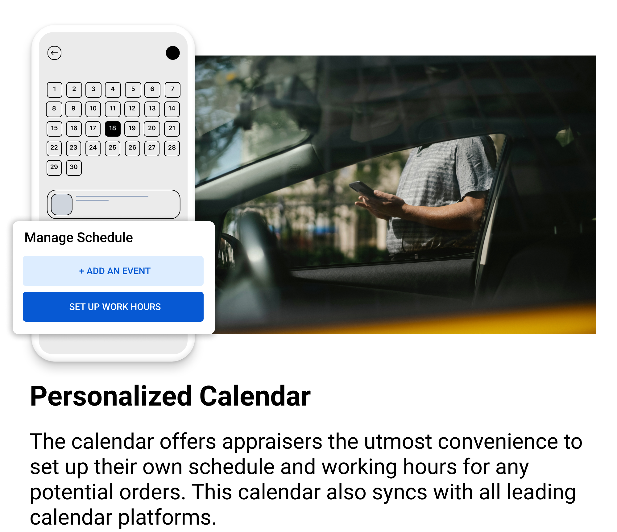
Overview today’s appointment / tasks status in Agenda, planning the calendar by shifting “Day,“ “Week,“ “Month“ view. All in one view. Color coded for multiple-tenancy / event types.
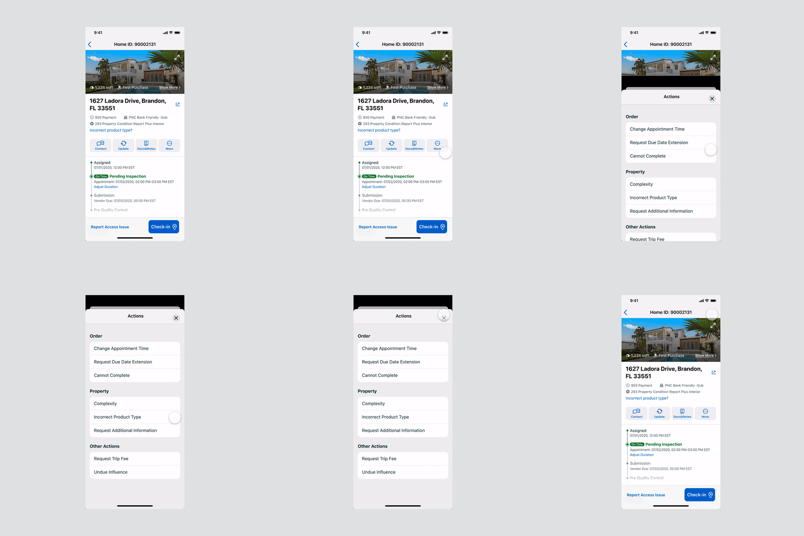
New Order Details Page with Noticeable and Easy-to-use UI Elements
✔ After
Refreshed order details page with a timeline and call-to-action buttons.
Before
Long scroll and hard to use actions.
Timely Alerts For Order Check-in / Check-out
Before
All notifications are put into the bell icons, with no alerts for check-in / check-out.
✔ After
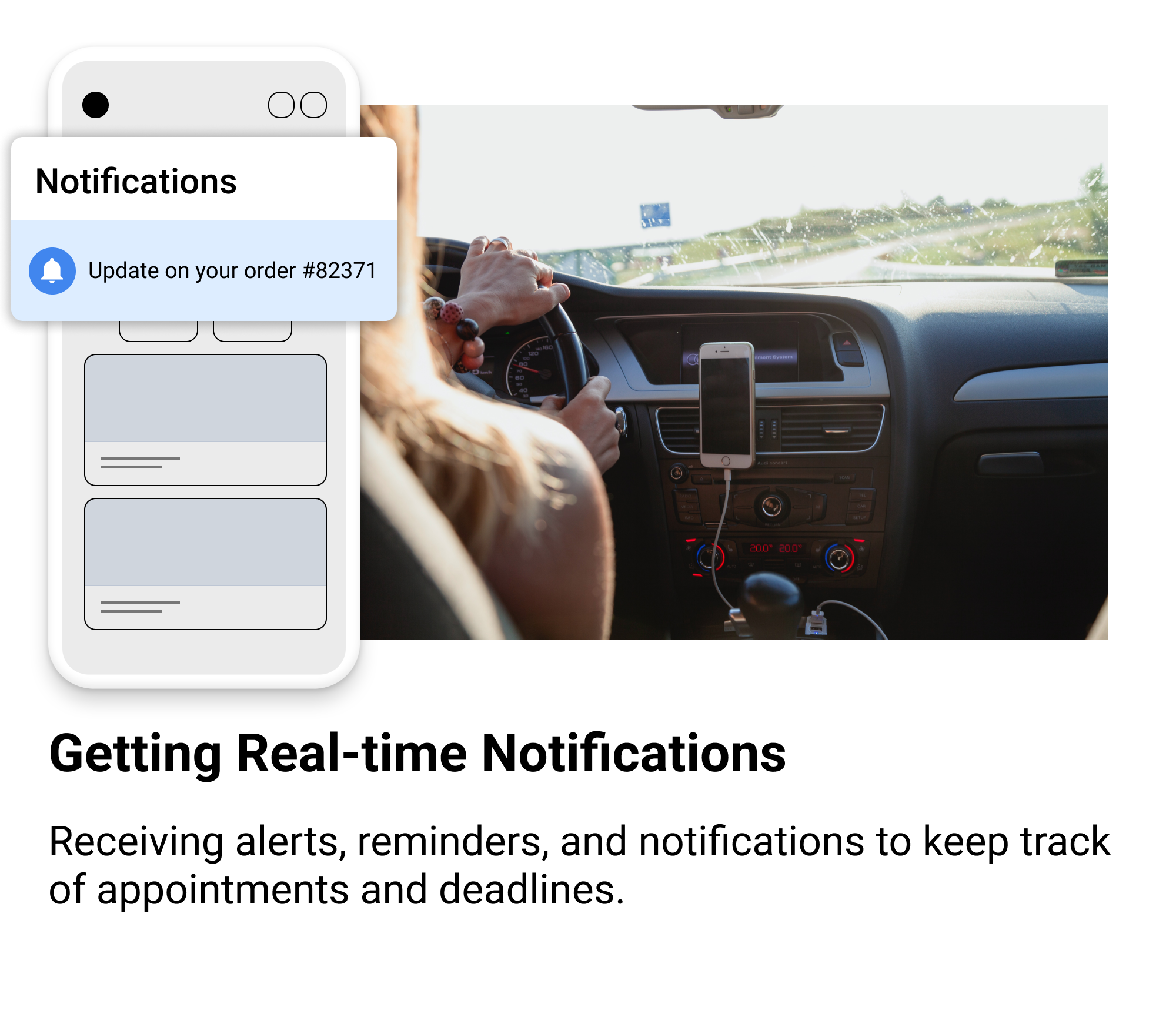
Device push notifications and In-App alerts, quickly respond to the message. The In-App alerts will prompt the alerts but they won’t influence what the user is currently doing.
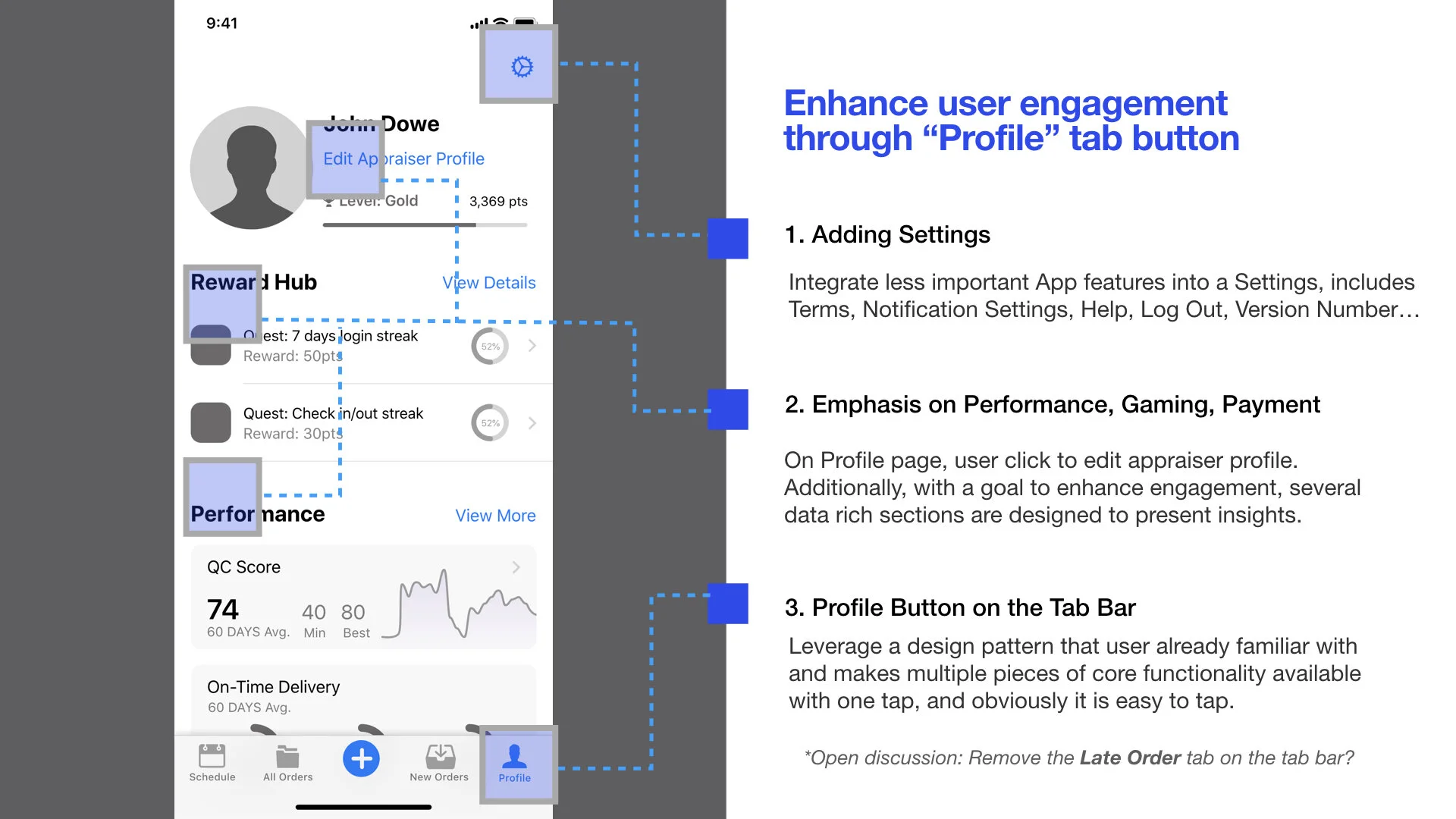
Profile Tab - A Home for Secondary, Non-Appointment Features
Before
Critical features like payments, performance, profile are hidden in the hamburger menu, the discoverability of these features is low.
✔ After
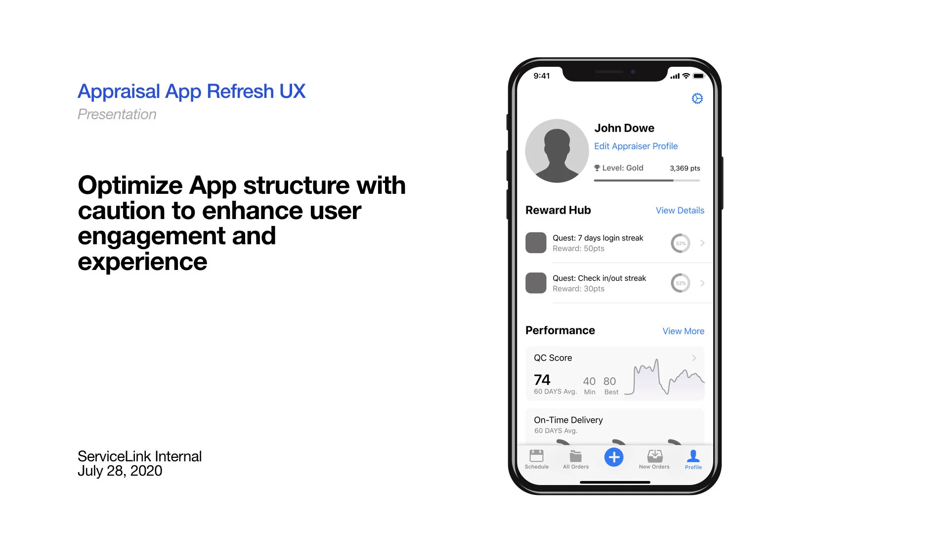
After refresh, Profile, Performance, Coverage are organized in the Profile tab and leave the less used features in the Settings icon.
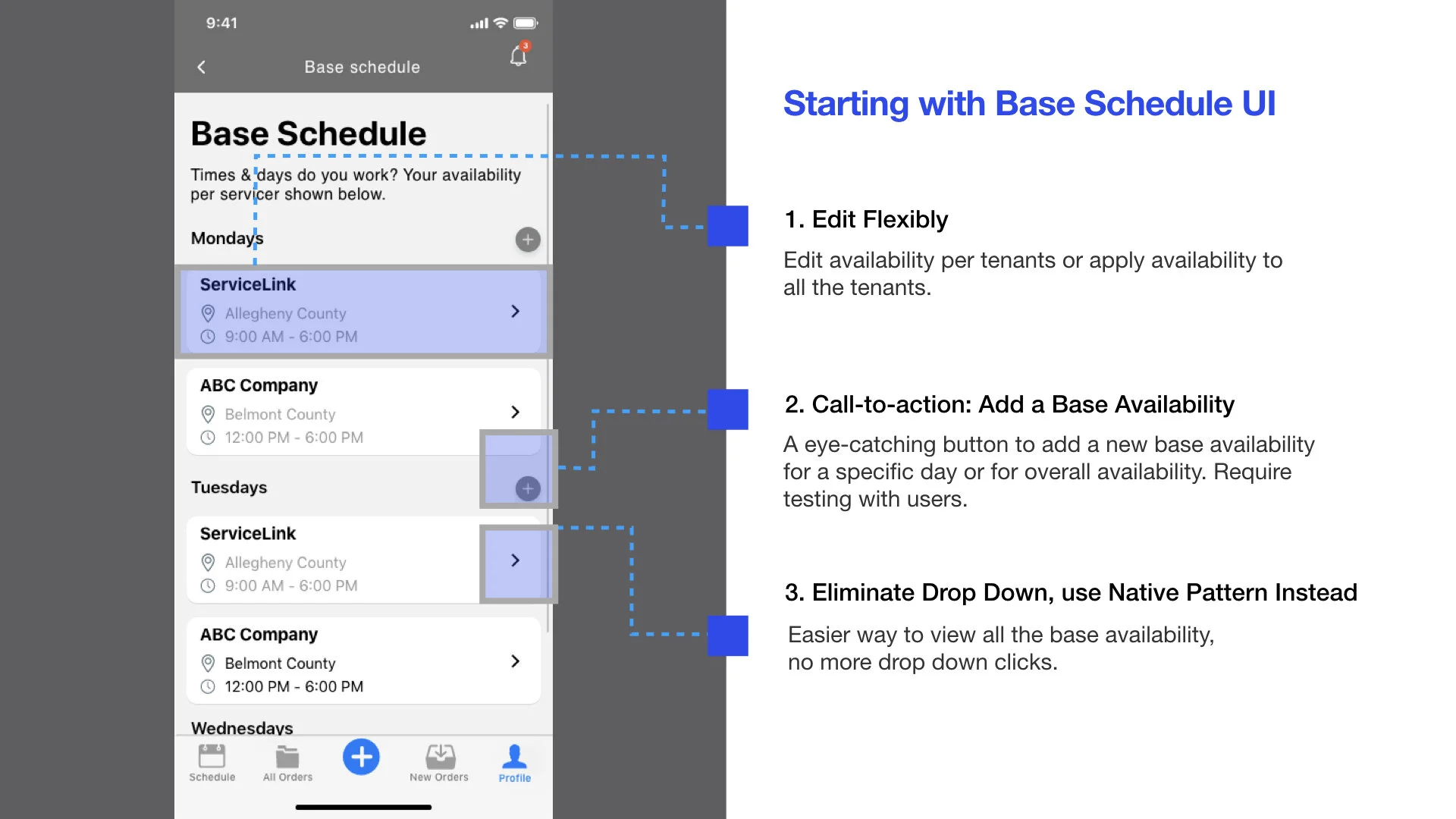
Base Schedule - Set up Your Working Hours in one Place
Before
All the drop-down in the Base Schedule are default folded, so it influenced discoverability. And the drop-down is combing with the Calendar Sync simple due to there is limited space in the hamburger menu.
✔ After
After refresh, the base schedule is default showing all the saved availability, and includes more features like ”multi-tenancy,” “apply to other days“, and “region.“
EXOS Voice User Interface - A Safer and Personalized Rider Experience
EXOS Voice - Due to the appraiser’s working nature, they spend a lot of time driving or walking onside. To provide convenience and maximize work efficiency, I envisioned and worked with the DEV team to implement a voice UI idea. It could work on both App side and wearable like iWatch to ensure that the appraiser can interact with the App directly through voice. A perfect use case, i.e., navigate to the next destination while driving.
Setup Flow - Make the Value Stand Out
We certainly don’t want to overwhelm the user with a bunch of ask “Permission“ alert, but they are critical for the App’s features and user’s convenience, so in this project, I pitch and work with the team for a setup flow and bring why we need permission and how these features works.
Security Enhancement: Multi-factor authentication
Muti-factor authentication and security enhancement, I design the screens for responsive web, mobile, tablet.
Dark Mode
We initially think the dark mode is as easy as provide a dark mode palette then we are done. But later on, it’s complicated for the App like this, every screen need testing to ensure the succinct color contrast and good readability.
* * *
More Process
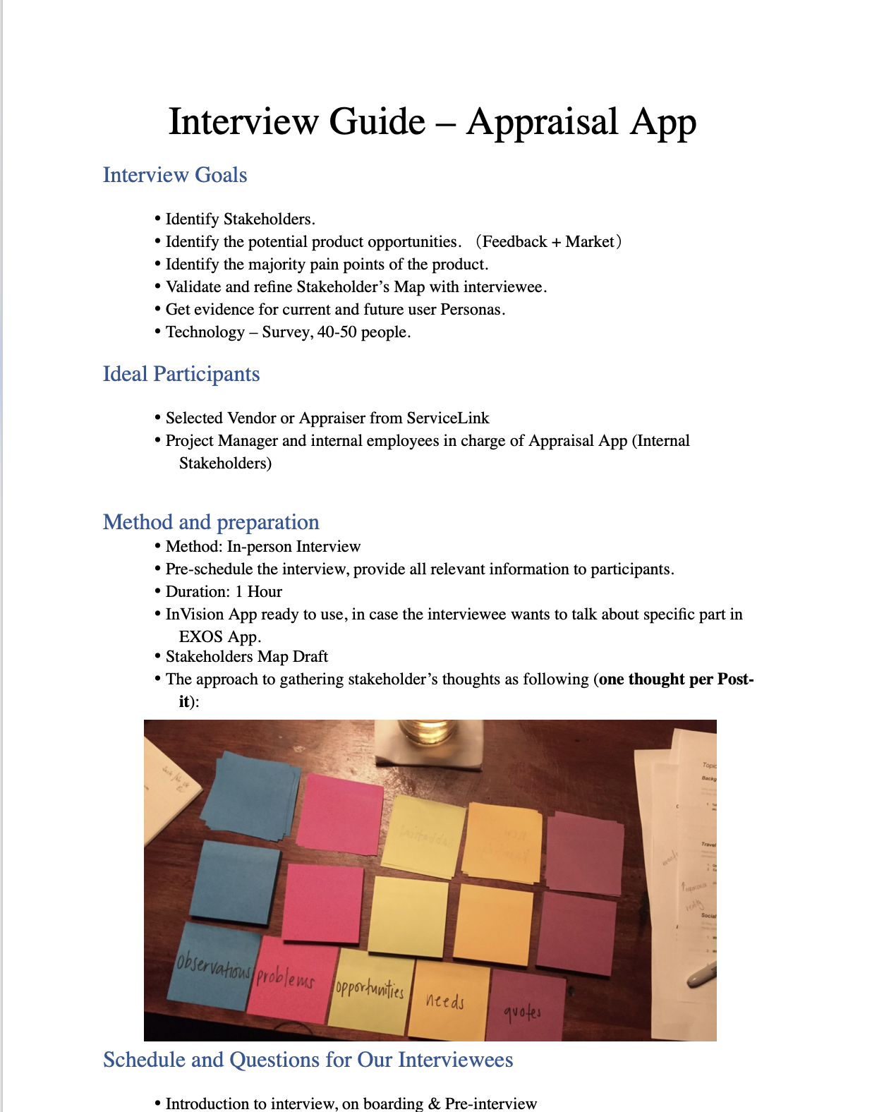
User Interview & Tech Survey
I conducted 6 interviews with the house appraisers to learn the problem background and their current workflow.
User Journey Mapping
Based on the User Interview insights, I designed a Journey map to help create a shared understanding for the team.
Facilitating Design & Critique Sessions with Stakeholders
I lead the design discussions/review sessions and drive a feedback loop around related stakeholders in Miro desktop App.
Workflow Diagramming
I work with Product Manage; Tech leads to identify any gaps and visually map out all the interactions/ edge cases for multiple essential features and delivered it to the DEV tea,
Design QA based on Zeplin
Once the screens are approved, the DEV team can see the screens and all the specs from the screens we uploaded to Zeplin.
As the Lead Designer, I also got a chance to start “Design QA. “I choose Samsung Galaxy Note 9 and iPhone SE to check the new App and see how it works on smaller screens.
EXOS Mobile Design System*
With all the native mobile design projects I’ve been leading, I got approval and started building a mobile design system to enforce future design consistency and progress.
The Launch
The Refresh EXOS Valuations App launched in April 2021. Both iOS or Android™ platforms are available.

Outcome
Reduced 50% cycle time
EXOS Valuations is credited with reducing appraisal cycle times by as much as 50%.
Impacting more than 4,000 appraisers nationwide.
EXOS Valuations has already been used to successfully support 750,000 appraisals by more than 4,000 appraisers nationwide.
Establish Design System - Mobile
A mobile design guideline is evolving to a design system based on this project. Currently work in progress with design director, mobile development director, mobile developers.
Worked on 800+ Screens, shipped 2 Apps on iOS/ Android
With the launch of the EXOS Valuations App, the company soon decided to reuse part of the components for another mobile App (EXOS Signing Agent) with moderate customization.
Reflections
Stakeholders that were involved in the very early design stage stayed permanently engaged with making user-centered decisions.
Be Resourceful, stay proactive, and resourceful. If you don’t have resources for robust in-person interviews and testing? Walk around your office and do guerilla testing.
Want more research/business inputs? Set up a meeting with the business teams or related stakeholders to hear their insights.
3. Launching is Only the Beginning
We have a good start, but it’s still day one. Even if we received a lot of positive feedback, the UX of the product needs a lot of improvement, and the product itself still needs validation from the user and the market.
4. The devil is in the details, be very careful about each of your design decision, it could mean a lot for the development team.
